Best Shopify Makeup & Cosmetics Stores
Complexion shopping, community, colour discovery and launch-led merchandising are the themes to watch in these twelve stores.
1. Fenty Beauty
Shade matching and inclusive complexion shopping
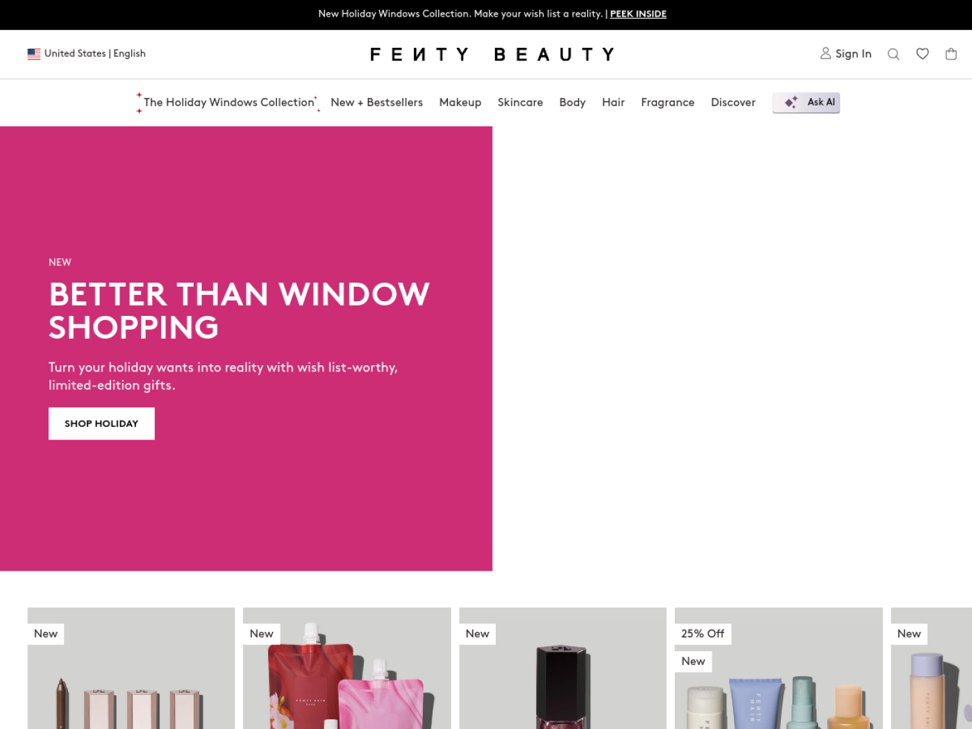
Fenty Beauty made a notoriously difficult online purchase, complexion makeup, part of its brand identity. A wide shade range is compelling, but range alone is not a shopping experience. The important storefront detail is the mobile shade finder, which asks for a selfie and helps visitors navigate undertones and foundation options instead of leaving them with a wall of nearly identical swatches.
The sales strategy combines inclusion with decision support. Fenty can introduce shoppers to a foundation through shade discovery, then move them toward related formulas and products. It has also experimented with exclusive product drops and a personalised gloss quiz in the Shop app, according to Shopify. The lesson is not that a quiz automatically increases conversion; it is that product discovery itself can become an engaging part of the campaign.
2. Rare Beauty
Brand purpose inside a highly shoppable makeup brand
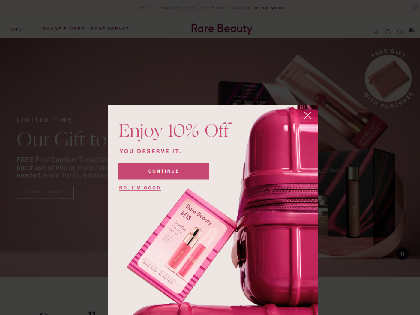
Rare Beauty is a reminder that a beauty brand can have a point of view without turning every product page into a manifesto. Its emphasis on self-acceptance and mental health gives the line a recognisable identity, while products and shades remain central to the shopping journey. The Rare Impact Fund gives the mission a concrete expression beyond an advertising slogan.
Its founder-led reach brings attention, but the more transferable strategy is linking community and values to product education and launches. Shopify has documented how a Rare Beauty pop-up connected an in-person experience to product previews in the Shop app. That is a useful example of turning a campaign into a route to purchase rather than measuring it only in impressions.
3. ILIA Beauty
Cross-product shade matching without guesswork
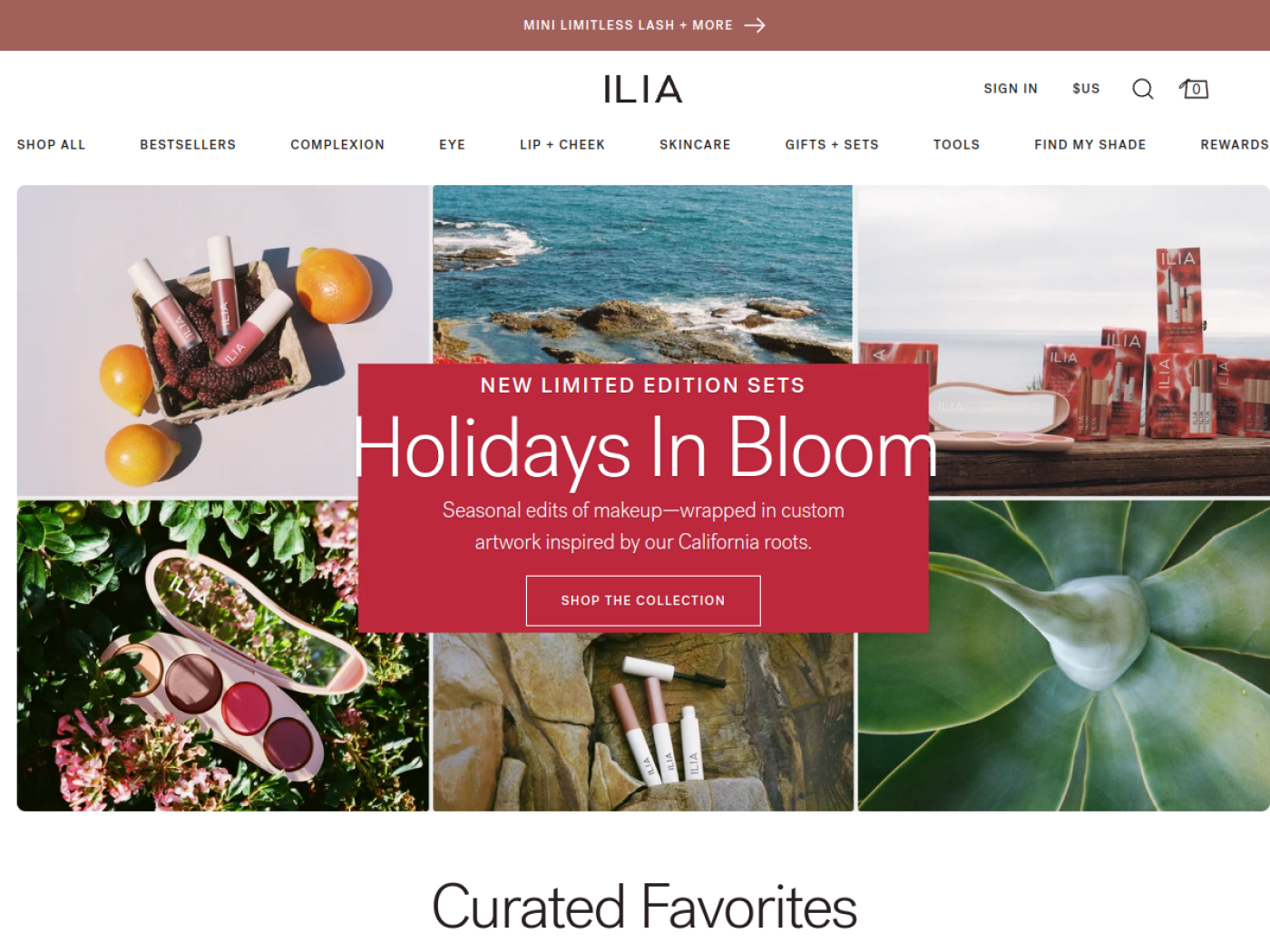
ILIA is particularly interesting if you sell complexion products across multiple formats. Its shade guide maps a customer’s known shade in one product to possible equivalents in another. That solves a more specific problem than a generic quiz: someone who already likes a skin tint does not want to start a foundation search from zero.
The brand has invested in a rich visual experience while preserving speed and usability. Shopify’s ILIA case study explains its move to a headless Shopify Plus storefront to improve the presentation of imagery and features such as Find My Shade and Compare Shades. The commercial logic is straightforward: helping returning customers cross between products can make the wider range feel easier to shop.
4. Glossier
Community, repeatable rituals and choose-your-own sets
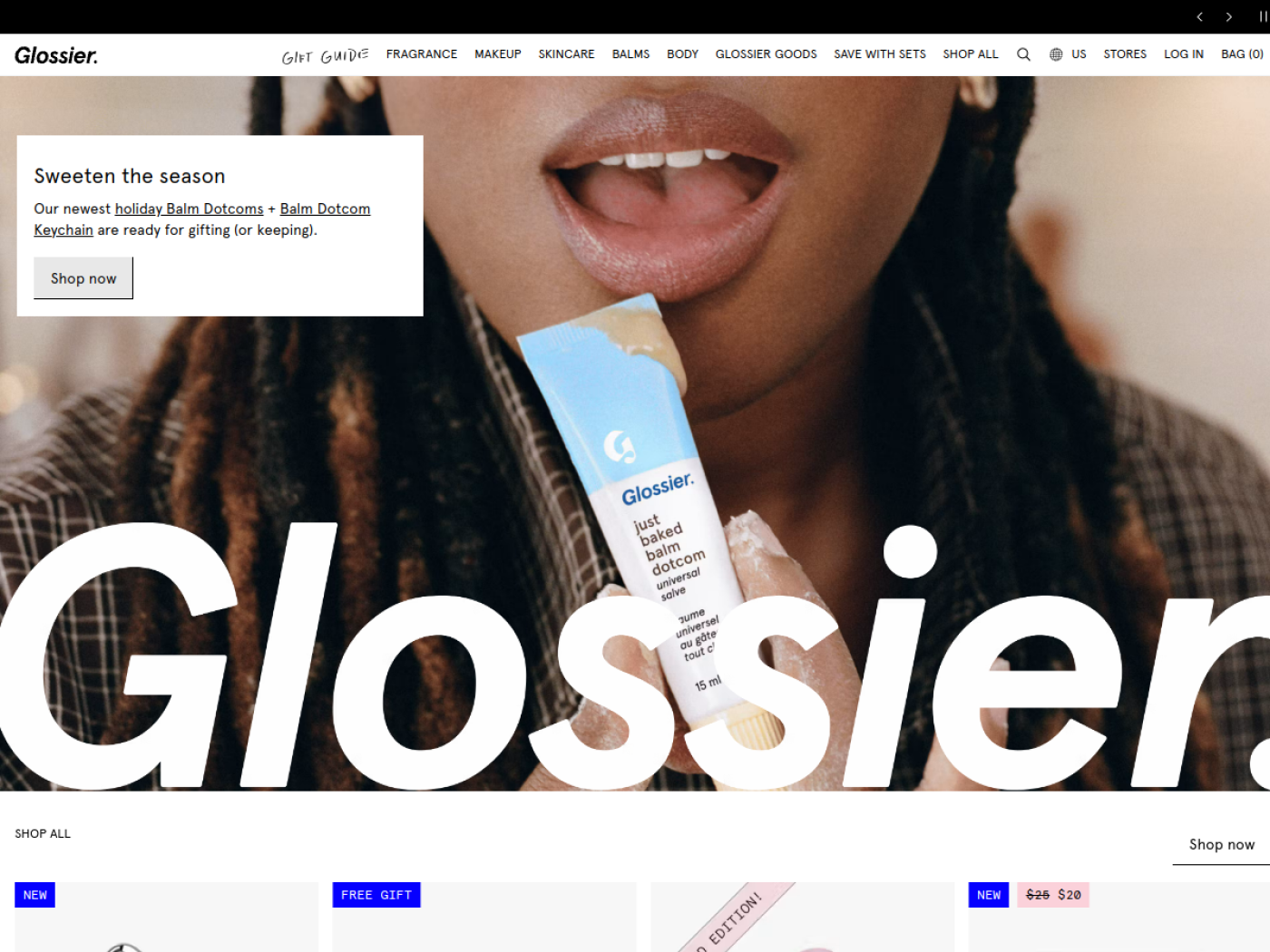
Glossier looks deceptively simple. The typography and product photography are restrained, but its collections make it easy to move from a single hero item to a complete look. The current Sets area includes combinations such as the Brow Kit, Lip Kit, Face Kit and fragrance duos, with several options letting shoppers choose their shades or scents.
That is more than a convenient grouping of products. A shopper who came for Balm Dotcom may find a natural pairing, while a new customer can explore a small curated routine without piecing it together from separate tabs. Outside the store, Shopify has documented a Glossier campaign that connected city billboards and early access through the Shop app, showing how the brand turns community attention into a shopping moment.
5. ColourPop
Collaboration-led launches that keep the storefront fresh
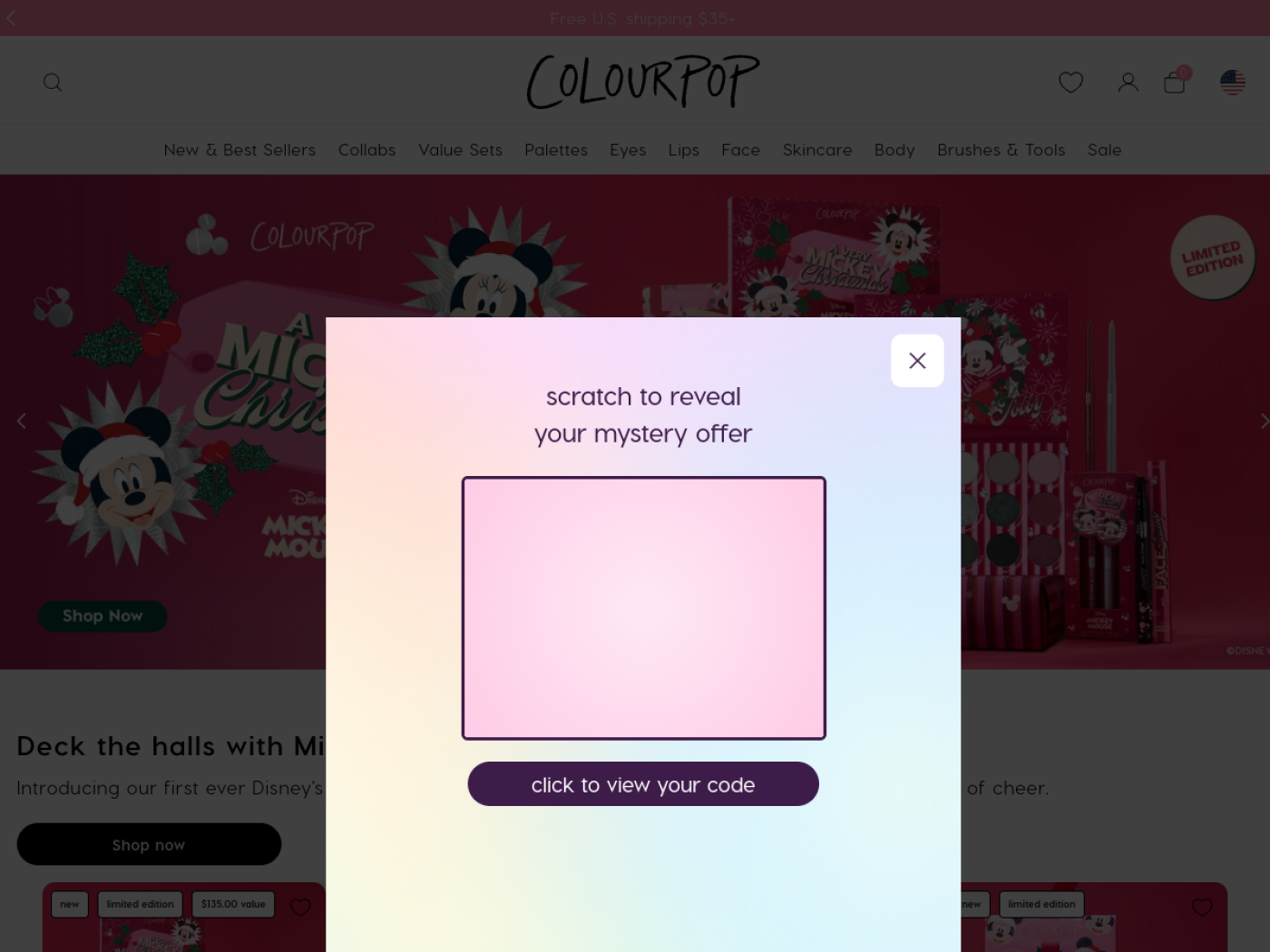
ColourPop sells the feeling of discovering something new. The collaborations area mixes themed palettes, lip kits and limited editions, turning each partnership into an entire shopping destination rather than a lone product tile. A shopper who arrives for a particular fandom can understand the collection immediately.
The selling model depends on frequent newness, recognisable creative themes and accessible combinations. Shopify’s earlier reporting on ColourPop described the operational speed enabled by its vertically integrated production model. That history helps explain the appeal, but a small beauty business should not mistake constant product drops for an easy strategy. Newness only works when inventory, photography and fulfilment can keep up.
6. Kylie Cosmetics
Hero products, coordinated lip kits and launch energy
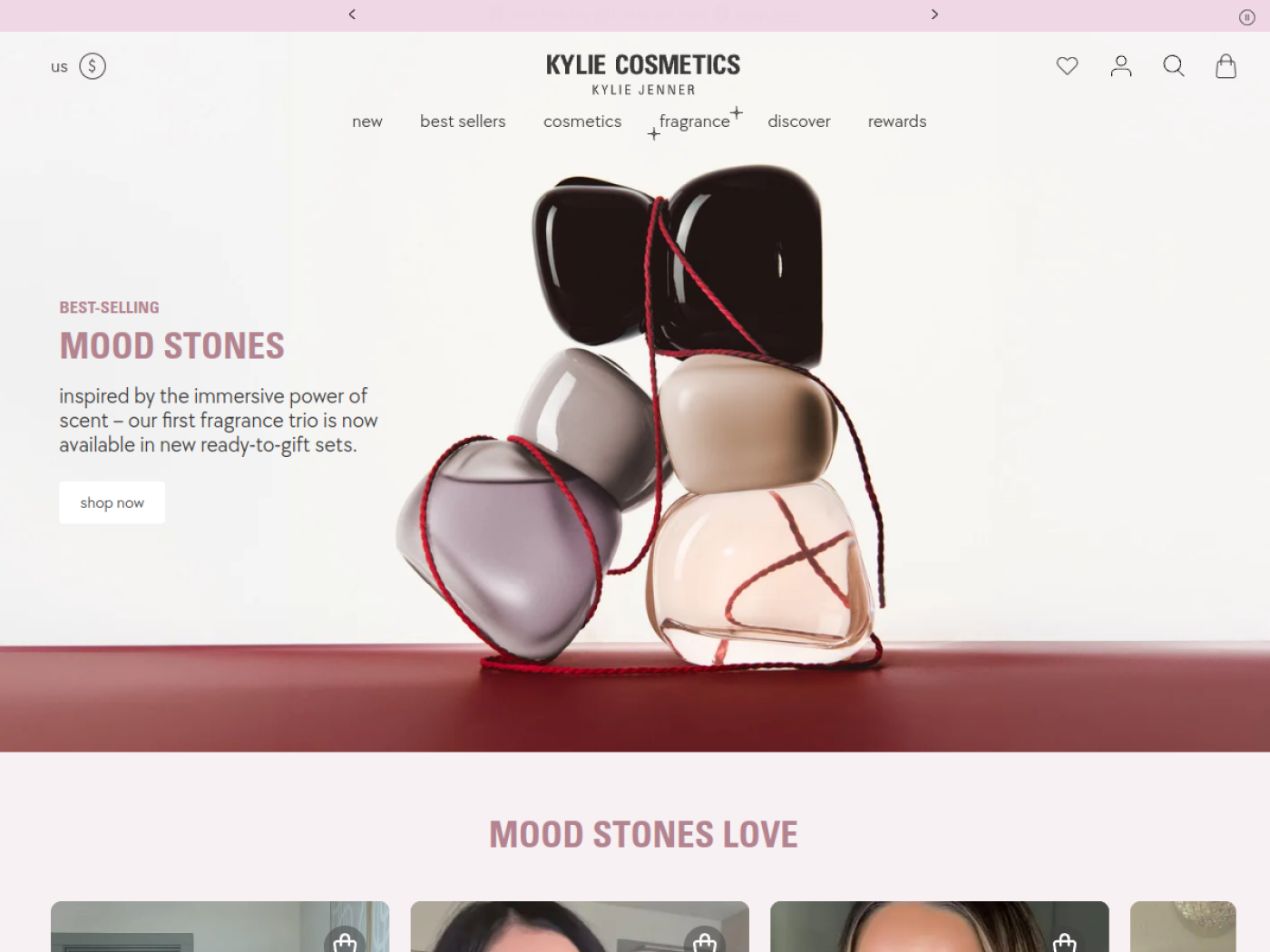
Kylie Cosmetics built its early identity around the Lip Kit, and the category is still an instructive piece of merchandising. Shoppers can browse lip kits by finish and shade family, view individual colour options and encounter related duos. Instead of making the customer solve the lip liner plus lip colour equation, the core format packages the result.
Founder visibility and product drops helped make Kylie a launch-led business. Shopify documented its early direct-to-consumer model and pop-up experiments. On the storefront, the useful selling principle is the hero product system: keep a signature format recognisable, offer enough variation for repeat interest and use a clear collection page to manage choice. The founder’s audience is not a tactic other brands can simply replicate.
7. KASH Beauty
Creator-led demand and international storefront execution
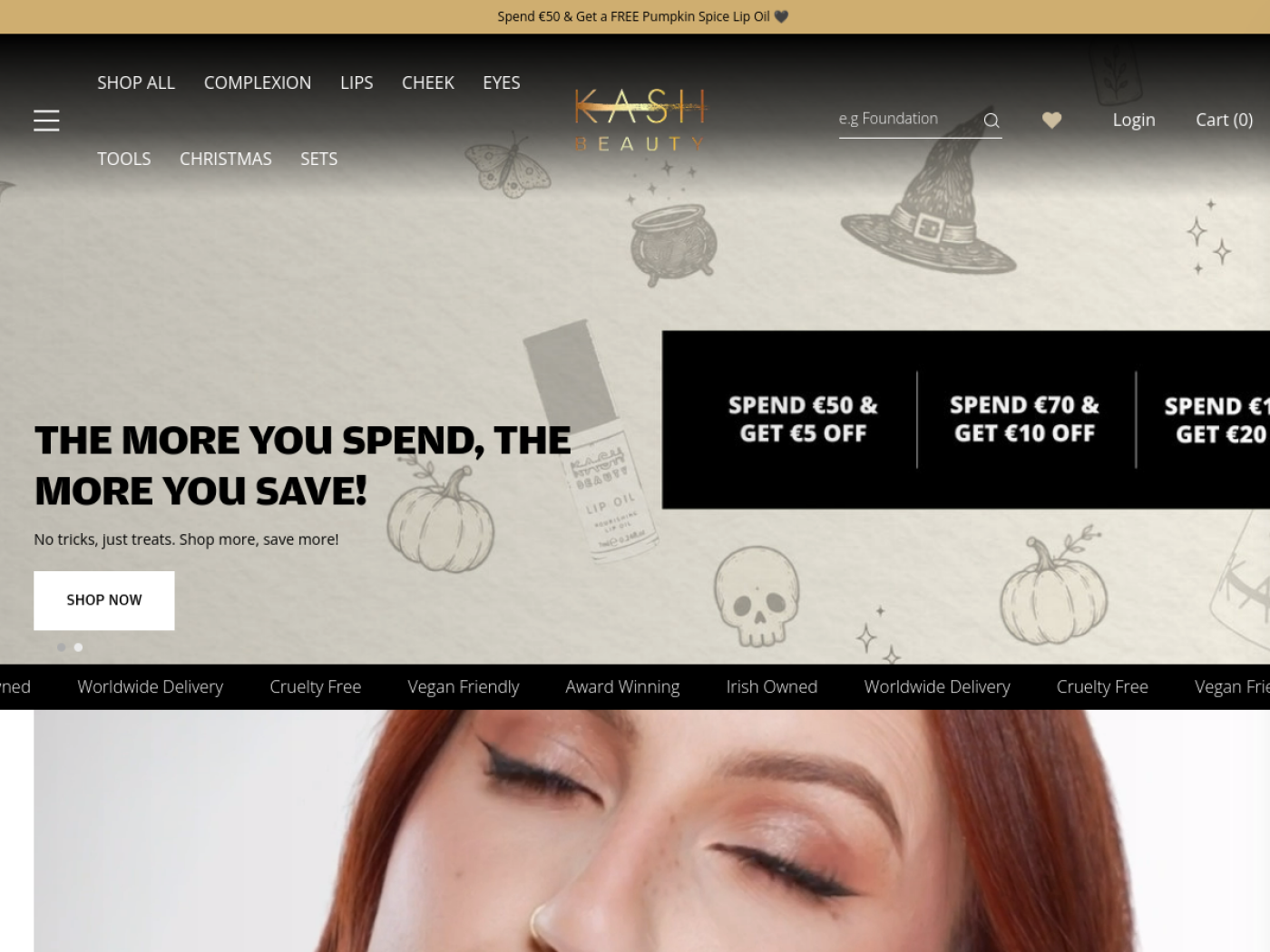
KASH Beauty is a useful alternative to yet another celebrity brand on an inspiration list. The Irish makeup company grew around creator Keilidh Cashell, whose makeup audience already understood her aesthetic. Its store extends that visual language into a product-led experience: palettes, tools and looks form a consistent world rather than disconnected launches.
Shopify’s case study gives a rare view of the operational side. The brand used Shopify Plus for social-driven traffic and invested in international storefront customisation and customer segmentation. This is not proof that any single layout caused its growth. It is evidence of a deliberate strategy: match local markets while making the brand recognisable to a geographically dispersed audience.
8. tarte cosmetics
Fast campaign execution around recognisable bestsellers

tarte is worth studying for a different reason: it has a mature product range, longstanding hero franchises and a marketing calendar that rarely stands still. Instead of expecting a first-time visitor to understand the entire catalogue, a strong beauty store can spotlight familiar bestsellers, looks and offers as entry points into a much larger assortment.
Shopify reports that tarte migrated its site to Shopify in 2026 to give teams greater control over campaigns, launches and the shopping experience. The important sales lesson is organisational as much as visual. A promotion is only as effective as the team’s ability to update landing pages, merchandise collections and keep the path to purchase consistent.
9. bareMinerals
Shade-finding support tied to distinct foundation finishes
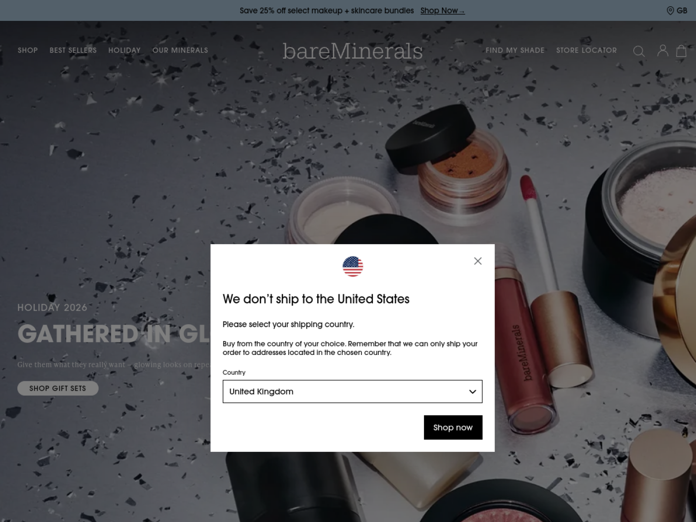
bareMinerals built its identity around mineral makeup, but its online selling problem is familiar to any complexion brand: shoppers need to pick a colour and a formula without trying them on. The foundation collection distinguishes coverage, finish and shade ranges rather than treating every foundation as interchangeable. That makes the range easier to compare even when two products both promise a natural look.
Its Virtual Shade Finder goes a step further. Customers can use a phone-based visual tool to explore suggested complexion matches and complementary concealer choices. The sales strategy is not simply adding an interactive feature. It is reducing the uncertainty between seeing a shade online and committing to it, while creating a sensible route to another product in the routine.
The useful distinction for a smaller store is between answering the shade question well and buying the most sophisticated technology. Accurate swatches, undertone labels and plain-language finish comparisons are the foundation. A virtual tool is worth considering only if shade choice genuinely creates enough friction to justify it.
10. Laura Mercier
Hero-product authority and clear finish-by-finish comparison
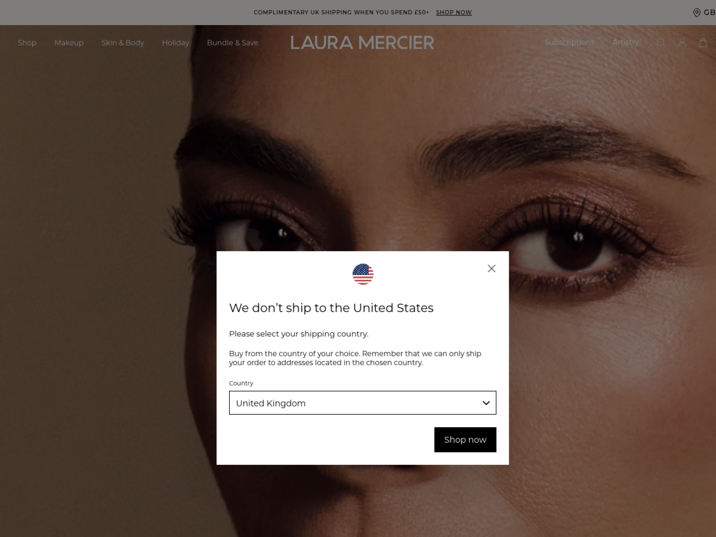
Laura Mercier is a useful example of how a long-established beauty brand can keep a single product category commercially important. Its setting powders are not buried in a huge catalogue. The dedicated collection leads with a familiar use case, then distinguishes products by finish, formula and wear claims. Shoppers can compare loose powder, an ultra-blurring version and a setting spray without first learning the entire product line.
That is the merchandising strategy to study: use a recognised hero franchise as the entry point, then organise adjacent options around different customer needs. The page also explains when to use setting powder in a makeup routine. Education is doing commercial work here because it helps buyers understand whether the next product complements something they already own.
None of this establishes that a particular comparison page caused Laura Mercier’s commercial success. What is observable is a store that turns product expertise into a navigable shopping decision. For a smaller beauty brand with one strong bestseller, that is a more useful model than expanding into unrelated products too quickly.
11. Dolly Beauty (Dolly Parton)
Celebrity identity turned into coordinated, shoppable product bundles
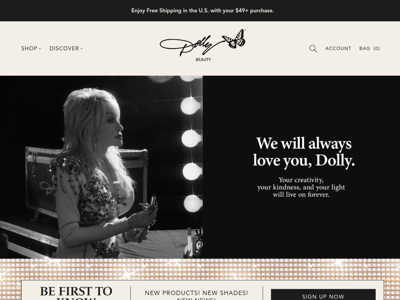
Dolly Beauty makes the connection between brand personality and product presentation unusually obvious. Lipsticks, glosses, liners, fragrances and giftable sets use a consistent glamorous visual language, so the products feel like parts of one collection rather than unrelated cosmetic purchases. Dolly Parton’s name creates an immediate point of recognition, but the online store still has to show shoppers what to buy together.
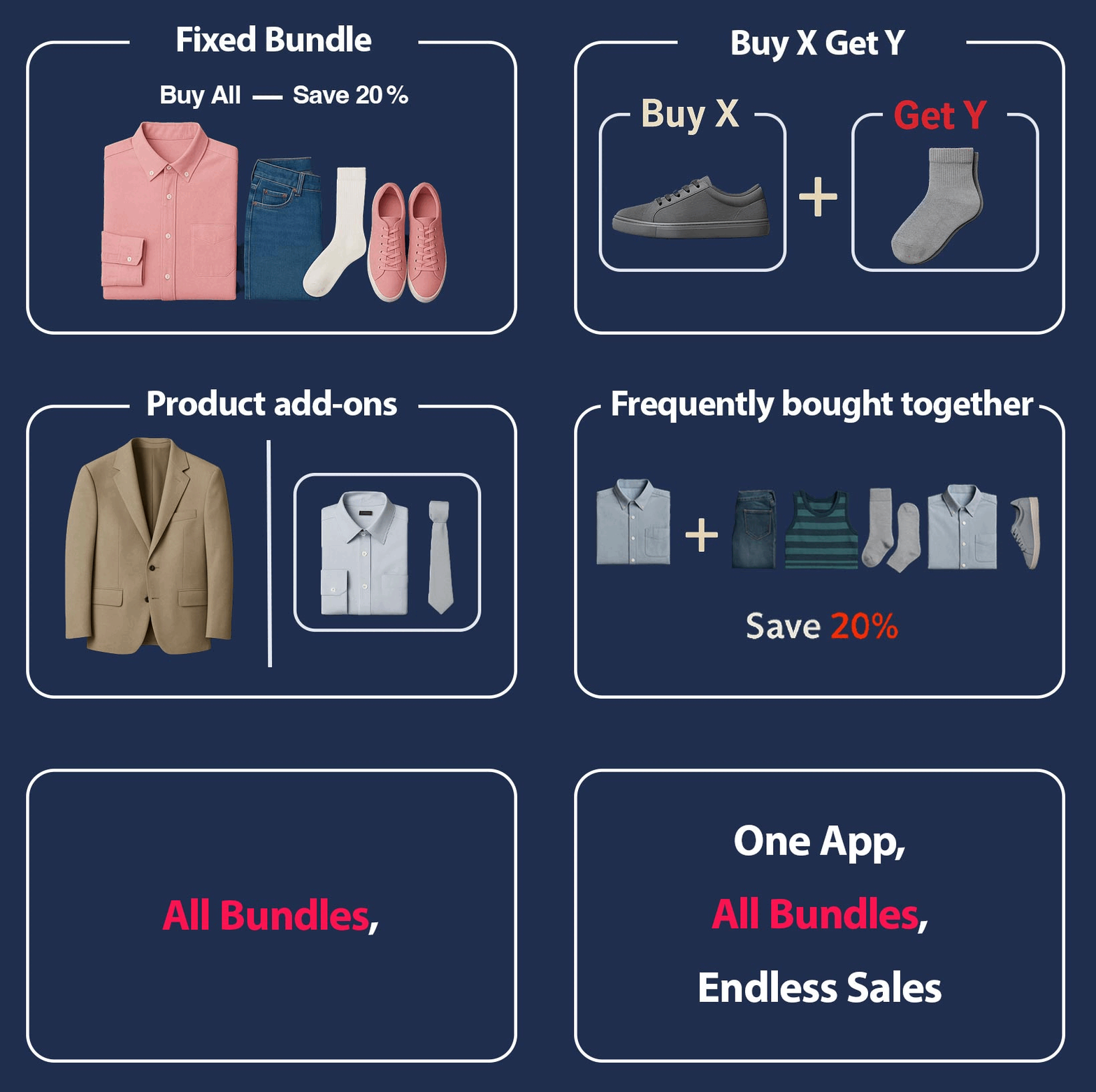
One storefront promotion captured in October 2026 invited visitors to build their own combination of three products and save 20%. The store also has curated bundles such as the All Dolled Up Bundle, which combines products for a complete makeup look, and the Ultimate Lip Bundle, which groups lipstick, gloss and liner. That offers two different paths to a multi-item order: let a confident customer choose, or give a newcomer an easy ready-made set.
The interesting sales logic is not simply discounting. A coordinated beauty look gives the set a reason to exist; the brand’s styling makes it feel giftable. This is a visible merchandising strategy, not proof that bundling alone explains the business results. Promotions and eligibility should be rechecked at publication.
12. Sigma Beauty
Build-your-own brush kits with a clear value ladder
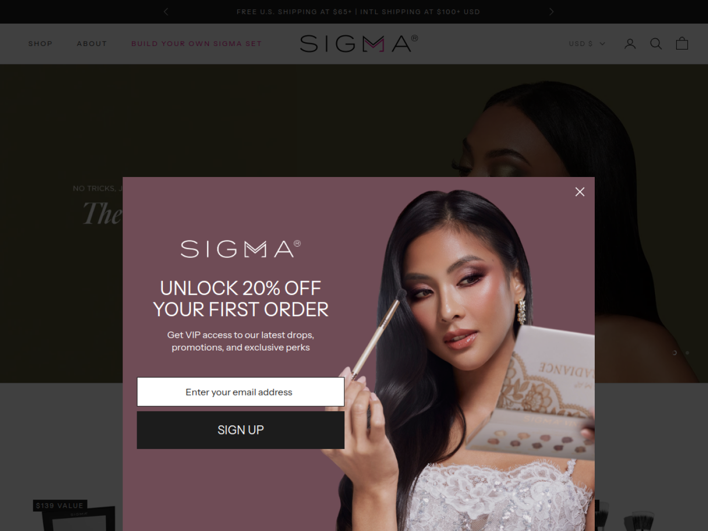
Sigma Beauty sells something customers often need in combinations: brushes for different parts of a makeup routine. That makes it a particularly relevant example for a cosmetics merchant thinking about how to sell sets without forcing everyone into the same kit. Its navigation separates face brushes, eye brushes, brush care, makeup and complete sets, while its product education helps a beginner understand why one brush differs from another.
The Build Your Own Sigma Set page lets shoppers select qualifying tools and cosmetics. The published offer describes a tiered saving structure: two items unlock 15%, four items 25%, and six or more 35%. It also shows the bundle total changing as products are selected. This is an example of using customisation and a visible threshold to make a bigger, intentional basket easier to assemble. The advertised percentages are promotional terms, not observed improvements in revenue or AOV.
The strongest part of the strategy is product fit. A beginner may want an eye-brush trio; a working artist may need a broader set and care tools. A bundle builder is most helpful when that flexibility reflects real differences between customers, not when the store is pushing unrelated excess inventory.
Best Shopify Skincare Stores
These nine stores show different ways to make ingredients, skin concerns and routines easier to navigate.
13. rhode
A tightly edited assortment built around a recognisable ritual
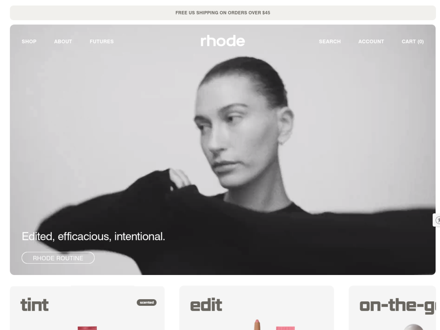
rhode makes a focused range feel like an advantage. Its minimal art direction and clearly named hero products keep the shopping decision contained. The rhode kit groups four daily essentials into one routine with a bag, so a new shopper can buy into the larger ritual without researching every product combination.
The sales strategy is disciplined assortment expansion. Instead of flooding the store with unrelated skincare claims, rhode repeats a coherent idea around simple, dewy skin and expands the brand with adjacent products and collectible formats. There is documented commercial scale behind the brand, but that does not establish the isolated effect of its page design. What we can actually see is a consistent path from hero product to complete routine.
14. Glow Recipe
Shopping by skin concern with an approachable personality
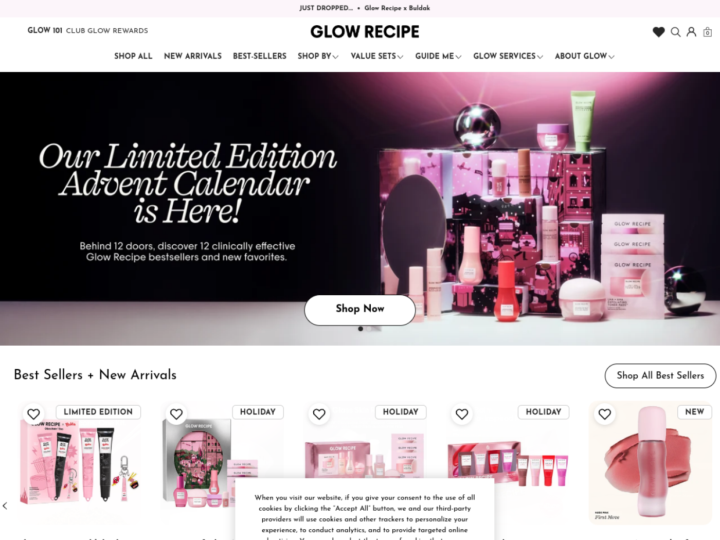
Glow Recipe combines bright, fruit-led branding with surprisingly practical navigation. Its site lets visitors shop by issues such as dark spots, dryness, pores or redness, then explore the products and ingredients associated with that concern. The concern guides do not stop at inspirational claims; they connect an explanation to a product discovery route.
The selling strategy layers education with merchandising. Current collection pages expose routine steps, skin concerns, formats and sometimes one-time versus subscription options. Kits offer a way to try the routine together. This makes sense in skincare, where someone may know the problem they want to address but not which serum or toner to buy.
15. Tatcha
Japanese-inspired ritual storytelling and premium value
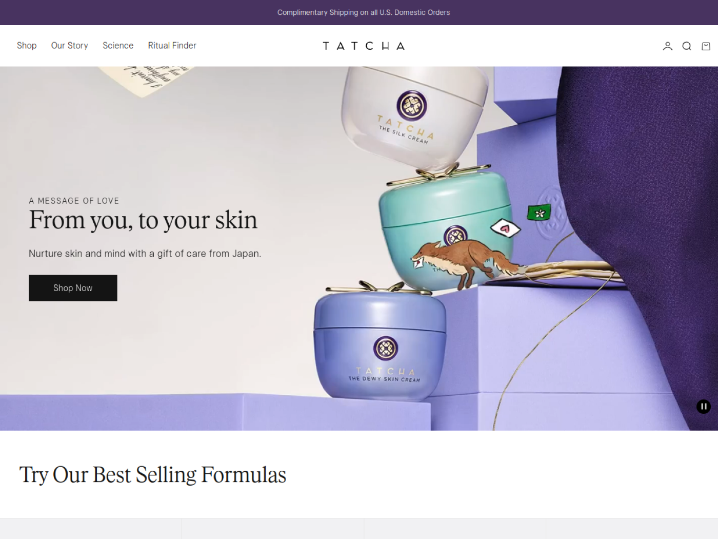
Tatcha offers a useful contrast to trend-driven beauty. Its visual identity is calm, its formulas are connected to a Japanese-inspired skincare story, and the brand presents cleansing and moisturising as parts of a ritual. The premium impression comes from how product imagery, copy and brand heritage work together, not from ornate design alone.
A ritual-based sales approach can make complementary products feel purposeful. A cleanser is not merely cross-sold with a moisturiser; each has a clear place in the experience the brand wants to create. That is an interpretation of the merchandising, not proof of a particular conversion lift. It is most credible when education genuinely explains the steps and product roles.
16. Summer Fridays
A hero-product family sold through travel-friendly sets
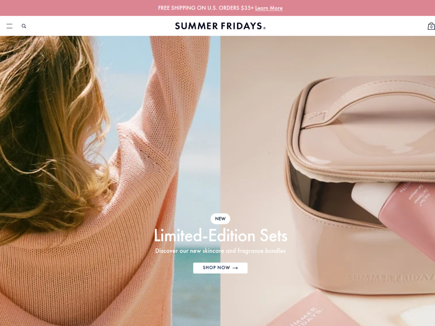
Summer Fridays built a clear story around Jet Lag Mask, and its present-day merchandising shows how far a hero concept can stretch. The Jet Lag Essentials Set brings together minis from the wider range, with each item given a specific hydration or soothing role. Shoppers see the contents and use instructions directly on the page.
This is a sensible way to bridge discovery and a fuller routine. A trial-friendly set can introduce a customer to several complementary products without committing them to full sizes. Summer Fridays also positions its products around everyday moments such as travel, not only a technical ingredient category. The result is a proposition a shopper can picture using.
17. Topicals
A specific skin concern turned into a two-product solution
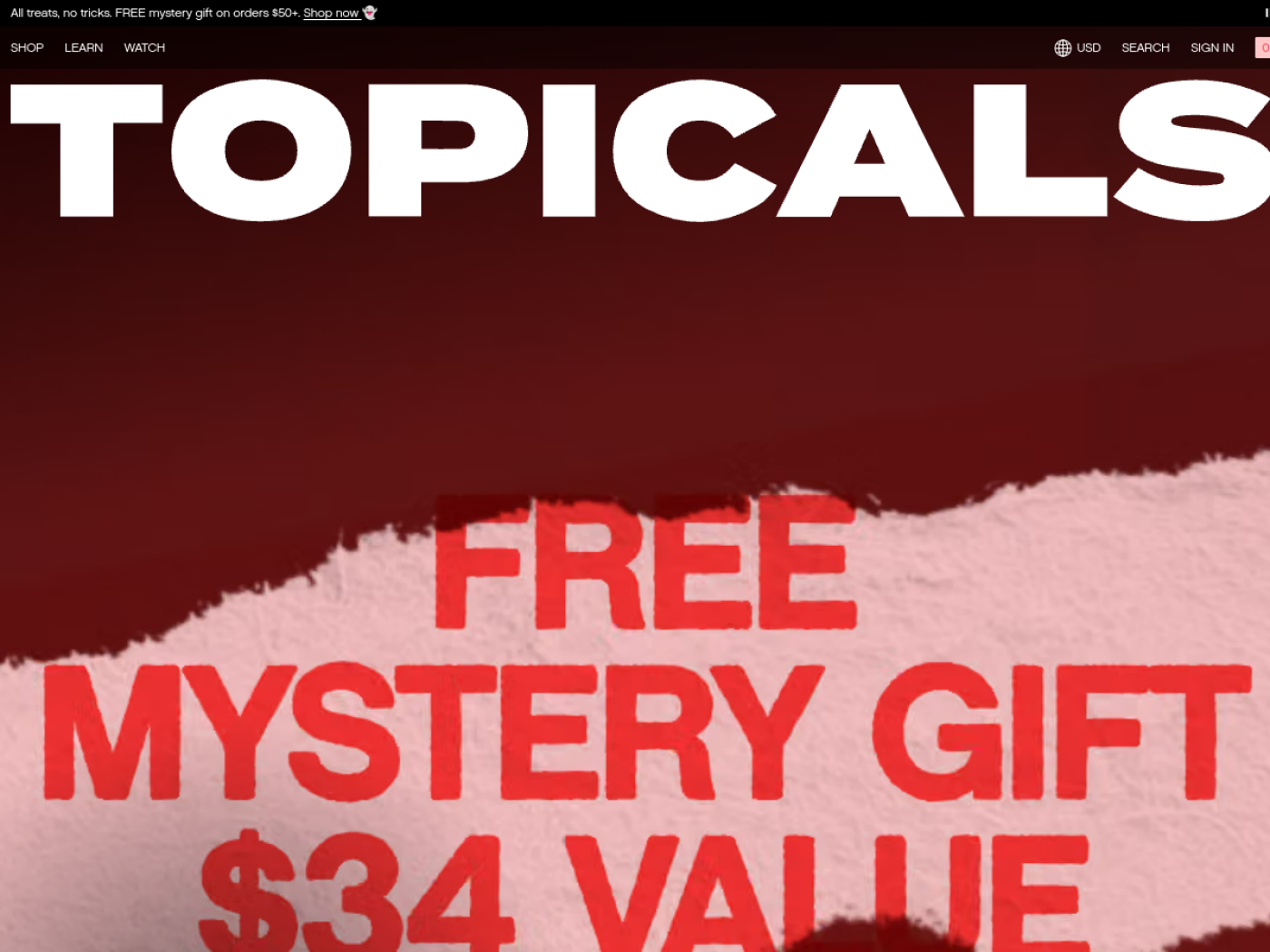
Topicals stands out by speaking directly to visible skin concerns rather than a vague promise of perfection. Its Discoloration Duo product page is especially revealing: two products share a single outcome-led explanation, application order, key ingredients and FAQs. A buyer does not have to leave the page to work out how the products fit together.
The commercial strategy here is problem-solution merchandising. Paired products make sense because the brand tells you what each contributes and how to use them. The important qualification is that skincare evidence belongs to the specific product and study; a statistic for one serum should not quietly become a claim for an entire duo. Topicals’ own page distinguishes the basis of its results claims.
18. Cocokind
Approachable barrier-care education rather than luxury mystery
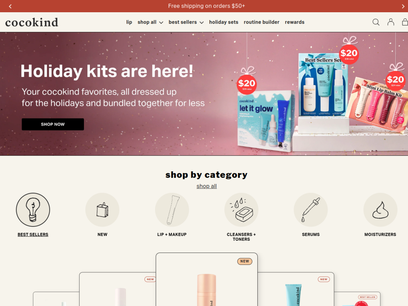
Cocokind offers a different type of aspiration. Its straightforward product naming and accessible science-first tone reduce the intimidation that skincare shopping can create. The brand is useful inspiration for merchants who cannot rely on elaborate editorial photography or prestige cues to explain why a formula belongs in a routine.
Its selling logic starts with clarity: explain what a product does, who might want it and how it sits alongside neighbouring treatments. For a value-conscious customer, intelligible guidance is part of the offer. That does not mean every shopper wants an ingredient lecture. The strongest page copy prioritises a clear benefit, then lets interested buyers dig deeper.
19. Dieux
A distinctive reusable product with unusually transparent FAQs

Dieux has an instantly recognisable product in its reusable Forever Eye Mask. The product page explains the use case with step-by-step photography, pairing suggestions, care instructions and even how long the brand’s testing indicates the printed logo lasts. It is a stronger example of product education than another generic “clean beauty” landing page.
The sales strategy uses a hero accessory to open the door to a longer skincare ritual, including compatible eye products. It also earns credibility by publishing conditions and limitations around consumer testing rather than leaving the buyer with a vague superlative. This detail is especially valuable for products whose benefits are difficult to judge from a static hero photo.
20. BYOMA
Distinctive colour blocking with a simple skin-barrier story
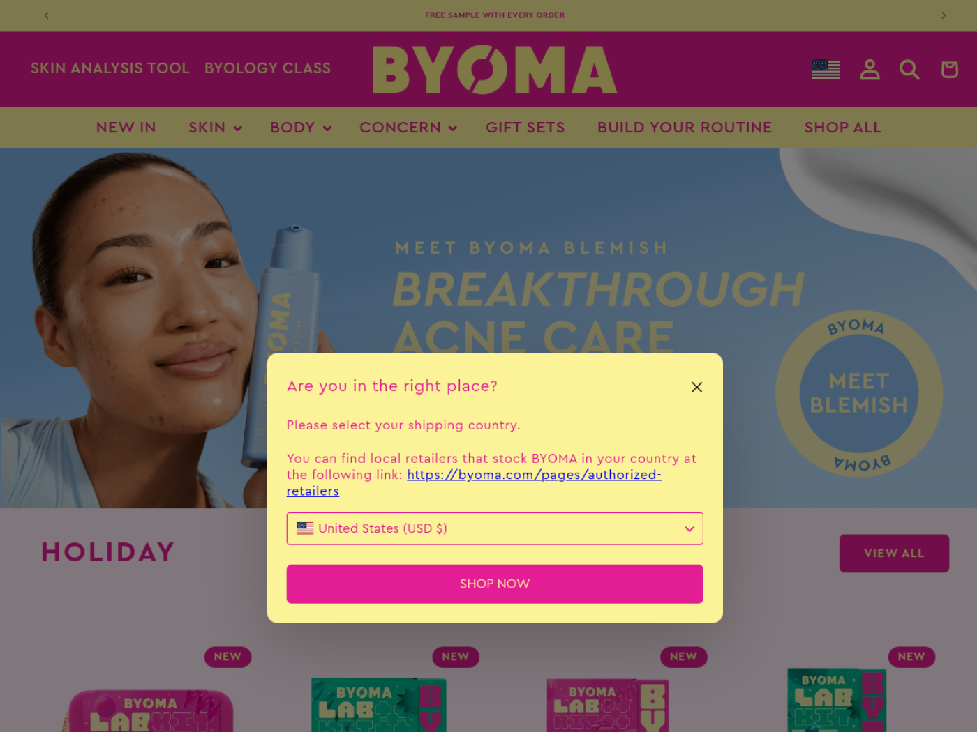
BYOMA demonstrates how a coherent visual system can help products stand out in a crowded category. Bright block-colour packaging makes the range recognisable, while the skin-barrier positioning gives its assorted products a shared reason to exist. For a merchant studying identity, the interesting lesson is the consistency between product design and how the range is presented online.
The selling idea is to make a fairly technical benefit approachable. Rather than marketing an overwhelming number of actives, a brand can organise a routine around the broader skin concern it wants to serve. The visual identity helps attract attention; useful information has to finish the job. A colourful product tile cannot answer whether a cleanser suits sensitive skin.
21. The INKEY List
A guided route from a skin question to a complete routine
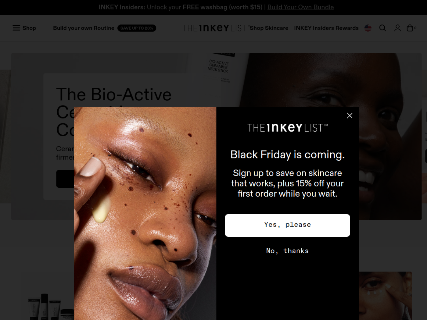
The INKEY List knows ingredient names are not the same as purchasing confidence. Its two-minute skin quiz asks about skin type, concerns and goals, then helps construct a personalised routine. The site also offers access to ingredient-focused support, so a customer has options beyond searching an enormous ingredient glossary.
The sales strategy is guided selection: first establish the need, then recommend a coherent set of products. The model creates a natural place for multi-item purchases, but a quiz is valuable only when the recommendation logic is trustworthy. For skincare, incompatible ingredient pairings or generic answers would undermine the very confidence the tool is supposed to create.
Best Shopify Haircare Stores
Hair type and scalp needs change which products belong together. These four examples make that specificity visible.
22. Gisou
Founder heritage turned into a recognisable hero ingredient
Gisou has built a distinctive world around honey-inspired haircare and its founder’s family beekeeping story. The visual style is glossy and warm, but the more interesting differentiation is that the ingredient narrative carries through the range. It gives disparate products a common identity that customers can remember.
The selling strategy is a hero-ingredient ecosystem: draw attention through a signature product, then offer complementary formats that belong to the same grooming ritual. This is more convincing when product descriptions show what each format actually does. The history creates interest; the product still needs to meet expectations.
23. Ceremonia
Scalp-first hair wellness with a specific cultural point of view
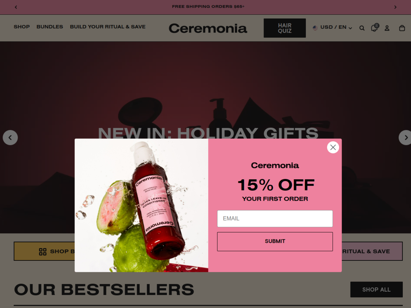
Ceremonia gives haircare an unusually clear entry point: start at the scalp. Its collections connect scalp oils, wash-day products and styling essentials, with a consistent visual identity rooted in the brand’s heritage. The brand does not need every product to be revolutionary because the ritual itself helps shoppers understand the range.
It also offers bundles as a navigation path, not simply a last-minute cart upsell. A set can solve the “which products do I need together?” question for someone building a routine. The commercial insight is that relevant categories and coherent groupings help a shopper move from discovery toward a usable regimen.
24. Briogeo
Deep filtering by concern, format and budget
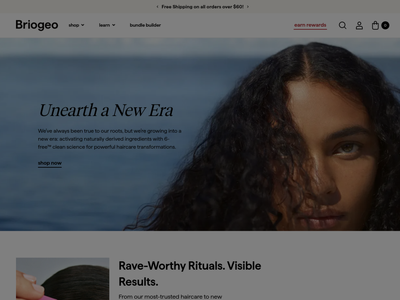
Briogeo is a good example of a large range that remains navigable. Its scalp collection can be filtered by product type, hair concern and sub-collection, while customers can choose between trial kits, value sets and full-size treatments. Someone dealing with a dry scalp can find an entry point without memorising the names of every range.
The sales strategy turns concern-led discovery into graduated purchase options. Minis lower the commitment needed to experiment; a value set can work for shoppers who already know the routine. That is more useful than indiscriminate cross-selling. The store is selling a practical next step as much as a product category.
25. Bread Beauty Supply
A clear wash-day identity for textured hair
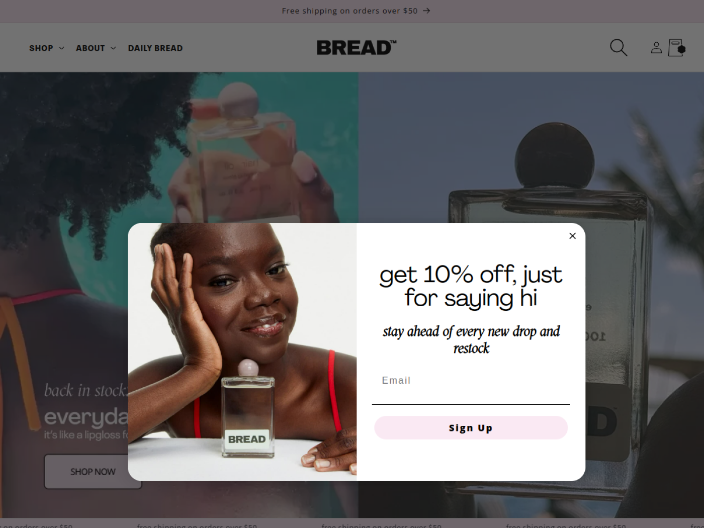
Bread Beauty Supply avoids generic haircare language by centring an identifiable audience and a wash-day ritual. Product naming, colour and packaging communicate that point of view quickly. For a buyer who has felt ignored by broad haircare merchandising, specificity can itself be the differentiator.
The selling approach is not to offer every imaginable hair product to every shopper. It is to assemble a manageable set of wash-day essentials and reinforce what each step is for. Merchants can learn from how a narrow audience focus simplifies product storytelling and encourages compatible purchases without needing to promise a one-size-fits-all solution.
Best Shopify Body Care Stores
Two contrasting models: turning body care into a premium ritual and designing a refill business around repeat use.
26. Nécessaire
Bringing skincare language and logic into body care
Nécessaire treats body care with the attention usually reserved for facial skincare. Its collection labels highlight product formats, active ingredients and fragrance options. The assortment includes fragrance-free variants, discovery collections and coordinated body-care duos, making the choice more specific than “pick a nice-smelling wash.”
The selling strategy is category elevation through a consistent product architecture. A shopper can select a body wash, see related steps and move into a routine based on concern or scent preference. The restrained editorial design communicates premium positioning, but the detailed labels and ingredient information help substantiate it.
27. Wild
A refillable product architecture built for repeat purchasing
Wild is one of the clearest examples of a business model expressed directly in a product page. Shoppers choose a reusable case, select scents and refills, and then decide between a one-off purchase and a flexible subscription. The product configuration and replenishment model explain each other.
Unlike most beauty brands in this list, Wild has first-party evidence on commercial performance: a Shopify case study reported £65 million in 2024 revenue across four regional stores and described its subscription mix. Those figures describe the business at that time, not the impact of the current PDP design. The transferable sales principle is putting repeat purchase mechanics into the product proposition rather than bolting them on later.
Best Shopify Fragrance Stores
These three stores tackle the central online fragrance challenge: helping someone choose a scent without being able to smell it.
28. DedCool
Scent discovery before a commitment to a full bottle
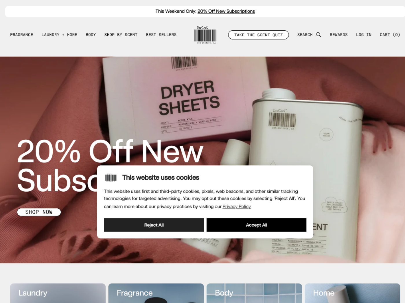
Perfume is difficult to sell on a screen because the defining product attribute cannot be displayed. DedCool addresses that with a dedicated samples area, build-your-own packs and a scent quiz. A curious visitor can start with a small purchase that helps answer the question the product photography cannot.
The commercial path is trial to full size. Current sample packs promote a future fragrance purchase offer, giving shoppers a reason to return once they know what they like. The brand also extends scent into adjacent home and personal-care formats, making its identity broader than the perfume bottle. Not everyone wants a blind buy, and the store makes that hesitation part of its merchandising.
29. D.S. & Durga
Story-rich fragrance discovery with a bridge to full size
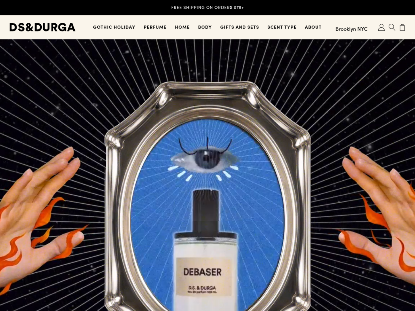
D.S. & Durga describes scents as experiences and stories, an effective approach for a product people cannot smell online. Its fragrance sets range from curated bestsellers to a configurable sample bundle. The product names and descriptions invite exploration rather than forcing a first-time buyer to choose an expensive full bottle immediately.
The sales mechanics are unusually explicit. The brand’s FAQ explains that its four-sample custom set comes with a credit towards eligible full-size perfume within a stated period. That gives a discovery purchase a second purpose: it is a route to the next order. The terms matter because an unclear credit can feel like a trick instead of a benefit.
30. Sabrina Carpenter (Fragrance by Sabrina)
Collectible scent storytelling and trial-size product ladders
Sabrina Carpenter’s fragrance collection demonstrates how recognisable creative direction can carry across multiple scents. Sweet Tooth, Cherry Baby, Caramel Dream and other releases share a playful, dessert-inspired identity and distinctive collectible-style presentation. The artist’s existing audience provides brand recognition, but visitors still need practical ways to choose a scent they cannot smell through a screen.
The official fragrance shop offers several entry points into the range, including smaller Bite Size eau de parfum products alongside larger bottles and collections. That gives a curious customer a lower-commitment first purchase, while sets create a gifting or collecting opportunity. The naming and visual identity make discovery feel like an extension of the brand story rather than a confusing list of fragrance notes.
Celebrity reach is not something an independent store can copy. The portable sales lesson is the product architecture: distinctive scent stories, readable fragrance notes, genuine smaller formats and a clear path from trying a scent to buying more. Public storefront observations do not establish what percentage of the brand’s sales come from sets or minis.