Best Shopify Pet Stores at a Glance
Best Shopify Pet Food & Treat Stores
The most instructive food stores do not assume that customers know the right recipe or order size. They help owners choose, then make replenishment manageable.
1. Lily’s Kitchen

Best idea to study: Make repeat ordering simple and flexible.
Lily’s Kitchen makes its food range approachable with separate dog and cat shopping paths, illustrated categories and recognisable recipe families. For a first-time customer, that is useful. Buying pet food online often means comparing formats, pack quantities, life stages and delivery costs, not just choosing a flavor.
Its subscription page explains the process in four steps: shop, select subscription, check out and manage the schedule. The page also makes skip and cancellation options visible. These details turn recurring delivery from a potentially restrictive contract into an understandable convenience.
The lesson is about timing. Ask for a repeat commitment only after the customer understands what they are buying and how often they need it.
Why this store stands out: Lily’s Kitchen turns a broad food catalogue into an understandable first order, then makes replenishment feel manageable through visible delivery and subscription controls.
Shopify theme: Not publicly verified. The exact live theme name should not be assumed from the storefront design.
Idea to borrow: Put one-time and repeat-purchase choices near each other, then explain how shoppers can edit the quantity, delivery interval or next order. Do not hide flexibility in the terms page.
2. Forthglade

Best idea to study: A guided build-your-own dog food box.
Forthglade goes further than offering a fixed mixed pack. Its Build a Box experience lets shoppers choose among wet food, dry food and extras while a visible box summary keeps track of selections and value. Filters for portion size and recipe type help narrow the range before the shopper commits.
The store also offers a pet profile and feeding guidance. That makes the builder feel connected to the dog’s needs rather than a random selection of discounted products. Its subscription information explains flexibility and delivery logistics separately, which helps customers assess the ongoing commitment.
The commercial idea is relevant for merchants with a broad but repeatable range: customization and replenishment belong in the same journey only when quantity and suitability remain clear.
Why this store stands out: Forthglade combines pet-specific feeding guidance with a configurable food box, making it easier to choose an appropriate range and establish repeat delivery. Its development partner reports a 42% uplift in total sales following a broader site redesign; that result cannot be attributed to the box builder alone. Agency case study.
Shopify theme: Quickfire (agency-built, customised Shopify 2.0 theme). Source. Theme details are based on public or third-party reporting and may have changed.
Idea to borrow: Let customers choose complementary flavors or formats in one box, show an updated total, and explain exactly how frequently they will receive it. Keep nutritional suitability more important than a bigger basket.
3. Open Farm

Best idea to study: Turn personalized feeding into a guided purchase.
Open Farm has a wide assortment across dog and cat food, with formats that are not easy to compare at a glance. A shopper might be considering kibble, freeze-dried products, toppers or a fresh-food meal plan. Instead of making every visitor solve that choice from a product grid, the brand offers Freshly Crafted meal plans.
The process uses pet details to recommend recipes, feeding amounts and deliveries. It also gives space to ingredient sourcing and clear feeding information. This matters because personalization is useful only if the customer understands what the recommendation is based on. The shopping experience should make the decision easier, not make a nutrition claim appear more certain than it is.
Why this store stands out: Open Farm offers guided meal planning and ingredient-sourcing information in a category where feeding confidence matters. It makes the reason behind a recommendation more visible than a generic product grid.
Shopify theme: Open Farm (store-specific name; not a verified off-the-shelf theme). Source. Theme details are based on public or third-party reporting and may have changed.
Idea to borrow: If the correct quantity depends on pet size or life stage, give shoppers a calculator or guided selector. Explain the assumptions and allow them to review the recommendation before subscribing.
4. KOHA Pet

Best idea to study: Organize products around the reason customers are shopping.
KOHA gives the shopper familiar dog and cat paths, then brings practical concerns into the merchandise. Its homepage highlights recipes for situations such as picky eating and digestive sensitivity, so customers can start with the question that brought them there instead of translating it into a product name.
The brand’s straightforward product cards and variety formats make the line easier to compare. An owner looking for more moisture in a cat’s diet, for instance, needs help understanding format, ingredients and feeding role before being asked to buy several cans. The valuable distinction is between making a product easier to discover and claiming it will solve a health condition.
Why this store stands out: KOHA reduces browsing friction by organising recipes around practical feeding concerns. This is a clear example of matching navigation to the question a pet owner brings to the store.
Shopify theme: Not publicly verified. The exact live theme name should not be assumed from the storefront design.
Idea to borrow: Build collection pages around common customer questions, but keep feeding guidance and any medical claims appropriately qualified. A condition-based label is not a substitute for evidence or veterinary advice.
5. Sundays for Dogs

Best idea to study: Use the quiz to explain the plan, not just collect leads.
Sundays sells air-dried dog food through a recurring-delivery model. The interesting part is what happens before that purchase: a short dog-food quiz and a tailored plan. The shopper is asked for meaningful details, including age and size, before being shown a recommendation.
Its subscription explainer describes how the suggested recipe, quantity and delivery frequency relate to the dog. That makes the checkout feel like the outcome of a selection process rather than the final step of a generic promotional funnel.
Quiz interfaces are not a shortcut to nutrition expertise. What a smaller store can borrow is the clarity of asking only questions that actually change the next recommendation.
Why this store stands out: Sundays makes a recurring purchase easier to understand by connecting a short dog-specific quiz with recipe, quantity and delivery guidance. The benefit is clarity rather than an assumption that quizzes always increase sales.
Shopify theme: Not publicly verified. The exact live theme name should not be assumed from the storefront design.
Idea to borrow: Map each question in a quiz to a real product or quantity decision. If two answers always produce the same result, the question probably adds friction rather than value.
6. Petzyo

Best idea to study: Offer a lower-risk way to try the product.
Petzyo provides several paths into its dog food range. On its storefront, the brand promotes a formula-finding route, a sample offer and the option to build a raw-food box with different flavors. These are different solutions for customers at different levels of confidence.
Someone new to the brand may want to try a smaller quantity before changing their dog’s routine. A returning customer may already know the preferred food and simply want a convenient restock. Petzyo makes those journeys more distinct than a general collection page would.
This is particularly relevant to ecommerce categories where taste, tolerance and routine fit cannot be fully evaluated from product photographs.
Why this store stands out: Petzyo gives customers several levels of commitment, from a sample to a configurable raw-food box. The journey is useful because pet food suitability cannot be assessed from photography alone.
Shopify theme: Dawn (likely customised). Source. Theme details are based on public or third-party reporting and may have changed.
Idea to borrow: Offer a genuine trial size or starter assortment when uncertainty blocks a first order. Clearly disclose shipping costs and avoid framing a sample as risk-free if it still requires a meaningful payment.
7. Pupford

Best idea to study: Pair products with the activity customers want to complete.
Pupford is not simply a treat catalog. Its training focus connects treats and equipment with practical instruction. The Training Essentials Pack, for example, is positioned alongside a 14-day training course, giving buyers a reason to understand how the pieces work together.
That changes the perceived job of the bundle. The customer is not choosing multiple snacks just to reach a discount threshold; they are buying a set of supplies for an identifiable routine. The page also includes product-use information and treat details, which matter when rewards will be given repeatedly during training.
For a smaller merchant, the concept is transferable well beyond pet training: connect a kit to a task, then teach the task.
Why this store stands out: Pupford makes its training bundle easier to justify by connecting the physical products to instruction and a defined activity. The customer buys a training system, not just several unrelated treats.
Shopify theme: Store-named custom configuration (pupford-shop/main); base theme unidentified. Source. Theme details are based on public or third-party reporting and may have changed.
Idea to borrow: Create one beginner kit tied to a real activity such as puppy training, grooming or travel. Add a concise guide showing when and how to use each item.
Best Shopify Pet Wellness & Supplement Stores
Wellness products create a different trust problem. Owners may care deeply about a specific concern but may also be unsure whether a formula, serving size or recurring plan is appropriate. The useful examples below focus on clarity rather than unverified promises.
8. Native Pet
Best idea to study: Connect a recommendation quiz with a configurable routine.
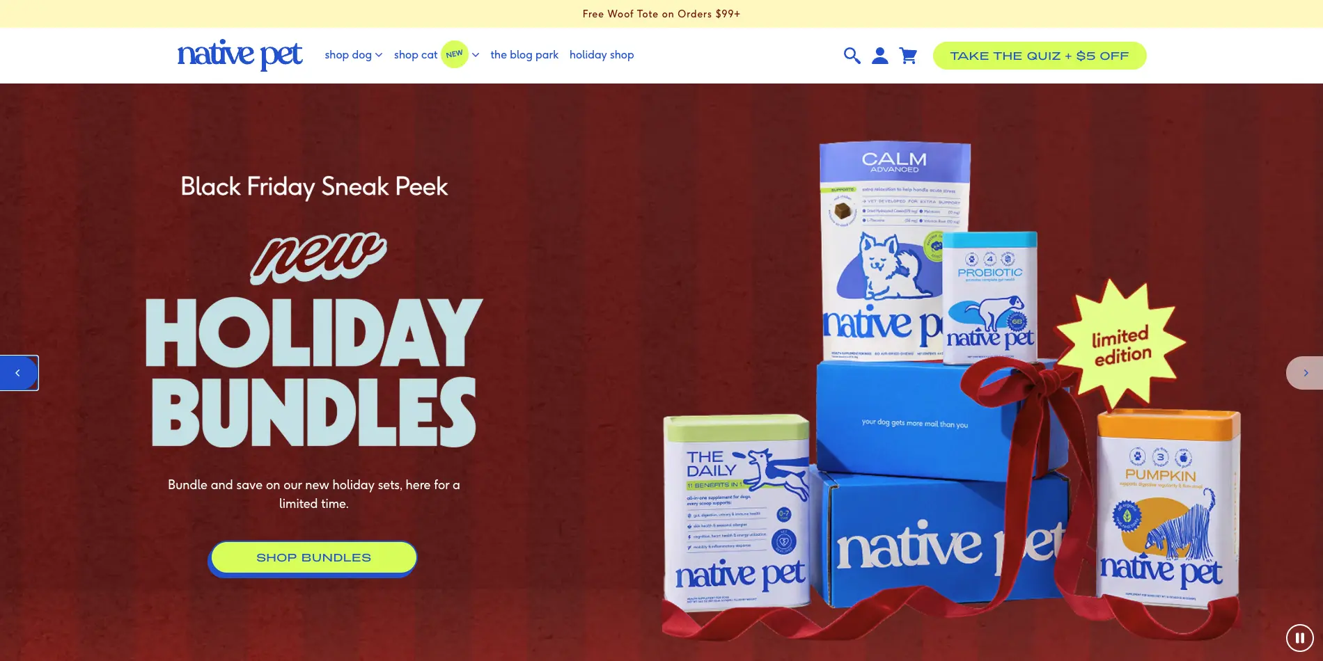
Native Pet lets customers build a bundle from products that serve different purposes, while its quiz asks about the dog’s needs before suggesting a routine. The store also groups products by familiar concerns, including digestion, skin and mobility.
This combination works as merchandising because it recognizes two different shoppers. Someone who knows the exact product can buy directly. Someone unsure where to start can use guided discovery. The builder also gives returning customers a way to assemble a routine without searching several collections.
The risk is over-recommending. A routine should not become a reason to sell every supplement in the catalog to every pet.
Why this store stands out: Native Pet combines concern-based navigation, a quiz and a build-your-own-bundle route. New customers get direction while returning customers can assemble familiar supplements.
Shopify theme: Bella (reported by third-party scanner; not independently checked). Source. Theme details are based on public or third-party reporting and may have changed.
Idea to borrow: Use a quiz only where the answers materially change the recommended products. Put ingredient information, feeding directions and suitability checks close to the result.
9. Zesty Paws

Best idea to study: Explain autoship before asking for commitment.
Zesty Paws divides its supplement catalog by dogs, cats and familiar purposes, making a large range navigable. The brand also gives Subscribe & Save its own explanation rather than leaving recurring orders as an unexplained checkbox.
The subscription page tells shoppers how to choose a product, select autoship and manage later shipments. This is important for a category where a customer may already be making a long-term purchase decision. A discount is an incentive, but control over schedule and cancellation may be what makes the option acceptable.
The store also places quality and sourcing signals near product discovery. Those signals should be considered on their specific merits, not treated as blanket proof of an outcome.
Why this store stands out: Zesty Paws brings the recurring-order decision into the shopping journey and explains how autoship works. Clear terms are especially valuable when the product is intended for repeat use.
Shopify theme: Focal (third-party directory report). Source. Theme details are based on public or third-party reporting and may have changed.
Idea to borrow: Explain recurring charges and control options in plain language. Show the one-time price, subscription terms and appropriate product-use guidance before the customer checks out.
10. YuMOVE

Best idea to study: Address risk around a repeat wellness purchase.
YuMOVE’s subscription experience offers an instructive combination of features: repeat delivery, savings, an option to manage orders and access to additional support. Its product pages also connect the selected pack to the pet’s size and recommended daily use.
The merchandising goes beyond a generic ‘save on every order’ message. It tries to answer whether the product is relevant, how long a pack might last and what help is available if the buyer is unsure. Those are more consequential questions than the color of an add-to-cart button.
Any performance or health claim belongs to its supporting evidence. Store operators can copy the clarity of the journey without copying claims they cannot independently substantiate.
Why this store stands out: YuMOVE addresses uncertainty about the product, pack duration and ongoing delivery before asking shoppers to subscribe. That makes its product education as important as its recurring-order discount.
Shopify theme: Not publicly verified. The exact live theme name should not be assumed from the storefront design.
Idea to borrow: Put the dosage context, support route and recurring-order terms near the purchase decision. Be precise about guarantee conditions instead of using vague reassurance.
11. Pet Honesty

Best idea to study: Let owners browse by concern, then inspect the evidence.
Pet Honesty highlights familiar concerns such as digestion, joint care, skin and calming products rather than expecting visitors to understand formula names first. Its homepage also places ingredient and research-related messaging prominently, often alongside specific product families.
That makes the catalog easier to enter. The shopper can begin with a problem and navigate toward a category, then examine the individual product. Where the site references customer studies or survey findings, the conditions and limitations of that evidence matter just as much as the headline.
From a merchant’s perspective, the useful model is concern-led navigation paired with accessible product-level information. It is not a reason to treat every consumer survey as medical proof.
Why this store stands out: Pet Honesty turns an extensive supplement range into concern-led paths, helping owners find relevant product information without having to decode each formula name.
Shopify theme: Not publicly verified. The exact live theme name should not be assumed from the storefront design.
Idea to borrow: Make concern categories useful, but separate product descriptions, owner experiences and independent evidence. Do not promise to treat or cure conditions without appropriate substantiation.
12. Wholistic Pet Organics

Best idea to study: Present a wide wellness range without making it mysterious.
Wholistic Pet Organics sells daily and purpose-specific supplements, with products such as Canine Complete, digestive support and salmon oil visible on its bestsellers page. The range gives buyers choices, but it also creates a need to understand how the formulas differ.
Its family-business story and specialist product focus help frame the assortment. More importantly for conversion, products need straightforward ingredients, directions and clear serving sizes. A well-organized supplement page should make it easy for a buyer to understand what the product is and what it is not.
For smaller wellness stores, this is a reminder that detailed product information can be a competitive advantage without requiring an elaborate quiz or a large technology stack.
Why this store stands out: Wholistic Pet Organics provides clear use-case entry points for supplements and foregrounds product ingredients and serving guidance. Its value as an example is specialist clarity, not verified sales growth.
Shopify theme: Not publicly verified. The exact live theme name should not be assumed from the storefront design.
Idea to borrow: Create a simple comparison table for adjacent formulas. Show pet eligibility, directions and the practical difference between products before promoting a multi-item set.
Best Shopify Dog Gear, Apparel & Lifestyle Stores
Food is consumed; a collar, crate or dog bed has to fit and last. Here the best selling ideas focus on product configuration, everyday use, safety and the confidence to buy something expensive online.
13. Wild One

Best idea to study: Merchandise a complete walking routine.
Wild One’s coordinated colors and restrained photography make its accessories immediately recognizable. But the stronger commercial detail is the Walk collection, which places harnesses, leashes, collars, bags and ready-made kits within one clear shopping journey.
A shopper can start with a single harness or look at an assembled walk kit. The kit’s product contents are explained, making the combination feel like a practical answer to a common need rather than a forced upsell. Matching colors add a style reason to keep the set together, while the buyer still needs appropriate size information.
The lesson is a familiar one for bundling: coherent products first, discount second.
Why this store stands out: Wild One presents matching harnesses, leashes and bags as a complete walking setup. The combination has an obvious practical and visual reason to exist, which makes attachment selling feel natural.
Shopify theme: Customised Dawn-based implementation (store name wild-one-dawn/main). Source. Theme details are based on public or third-party reporting and may have changed.
Idea to borrow: Build sets around a recurring activity, such as a daily walk. Let customers see each included item, choose the correct size and understand the total price without leaving the page.
14. Fable Pets

Best idea to study: Justify premium design with useful detail.
Fable treats pet products like long-term household objects. Its Signature Crate doubles as a side table, and the product page explains the material choices, available sizes, door options and compatibility with related bedding.
That is important because premium styling alone is not enough at this price point. The customer needs to understand the crate’s function, the space it occupies, and whether it suits the dog. Fable also includes specific safety and sizing information, which is more valuable than a broad claim that a product fits every pet.
The commercial pattern is thoughtful attachment selling: a crate and correctly sized bed make a more logical pair than an arbitrary assortment of accessories.
Why this store stands out: Fable Pets gives a premium crate a dual role as functional pet furniture and a household object. Detailed sizing and compatibility information help explain why the item costs more.
Shopify theme: Custom / agency-developed theme (listed by a detector as Shopify Theme Lab). Source. Theme details are based on public or third-party reporting and may have changed.
Idea to borrow: For high-consideration products, provide clear measurements, configuration options, material details and compatibility notes. Only cross-sell accessories that genuinely fit the selected product.
15. Ruffwear

Best idea to study: Reduce sizing uncertainty with education.
Ruffwear sells outdoor gear, including harnesses, jackets, boots and life jackets. These products vary in purpose and fit, so the question is not simply which color the buyer prefers. The store’s How to Fit hub addresses those decisions with product-specific tutorials and guidance.
This is a strong example of support content doing work before a sale. Measuring a paw or fitting a harness correctly may prevent a poor purchase choice and a frustrating return. It also makes the difference between similar products easier to understand.
For a merchant, a detailed fit guide is often more achievable than building a highly interactive product configurator. Good visuals and a reliable measurement process can do much of the same job.
Why this store stands out: Ruffwear removes a major barrier to buying technical pet equipment: fit uncertainty. Its guides make highly specific products easier to choose and may reduce avoidable mismatch, though no return-rate effect is established here.
Shopify theme: Custom (not a named Theme Store theme). Source. Theme details are based on public or third-party reporting and may have changed.
Idea to borrow: Add size diagrams and short fitting videos next to the size selector, especially when product sizing varies by model. Avoid relying on breed or weight alone as a perfect fit guarantee.
16. Spark Paws

Best idea to study: Create complementary purchases through matching collections.
Spark Paws makes matching owner-and-dog apparel a central part of its merchandising. Its matching collection includes corresponding hoodies and other styles with separate product types, sizes and colors.
The combination is easy for customers to understand. A shopper arrives for a dog hoodie and finds a related human version, or the reverse. That is a cross-sell rooted in a shared design preference, not a generic product recommendation. The challenge is making the two sizing systems and return conditions straightforward.
The store also uses a playful, recognizable tone without making product detail secondary. That balance matters for apparel, where fit is a larger issue than impulse interest.
Why this store stands out: Spark Paws makes matching dog-and-owner apparel an intuitive cross-sell. The purchase rationale comes from a shared design, while separate sizing needs remain an essential part of the experience.
Shopify theme: Not publicly verified. The exact live theme name should not be assumed from the storefront design.
Idea to borrow: Use shared prints or colors to link complementary products. Let shoppers compare human and pet sizes independently before offering a matching set.
17. Zee.Dog

Best idea to study: Show what a versatile product actually does.
Zee.Dog pairs an expressive design language with functional dog-walking gear. Its hands-free leashes can be used in multiple configurations, including around the waist or across the body, and are merchandised with color and product-type filters.
This is a useful contrast to a catalog that leads only with specifications. Customers want to picture the walk: carrying coffee, using both hands or changing leash length. Demonstrating those scenarios gives the feature a practical meaning. It also makes compatible collars and harnesses easier to discover.
A brand can be playful and technical at the same time, provided it does not hide important measurements or usage limitations.
Why this store stands out: Zee.Dog shows multiple real-life uses for functional walking gear, allowing shoppers to picture how a hands-free leash fits their own routine. Strong visual identity supports, rather than replaces, product explanation.
Shopify theme: Essence (reported by third-party theme index). Source. Theme details are based on public or third-party reporting and may have changed.
Idea to borrow: For multi-use gear, show the different configurations with clear photography and captions. Do not assume shoppers can visualize a mechanism from a feature name.
18. FuzzYard

Best idea to study: Use seasonal collections to organize a playful catalog.
FuzzYard’s colorful dog and cat accessories support a high-energy shopping experience. Its toy collection contains a broad assortment, with filtering for pet type, size, color and theme. Seasonal ranges create a reason to browse again without changing the brand’s underlying identity.
The business also experiments with themed product sets, making related designs easier to discover together. That is especially useful for gifting and smaller accessories. A shopper who likes one character or pattern can move to related pieces without starting over.
The operational trade-off is real: every limited collection creates more photography, inventory and navigation work. Smaller stores should not copy the drop frequency without the capacity to support it.
Why this store stands out: FuzzYard keeps a wide accessory catalogue interesting through distinctive patterns, themed collections and seasonal launches. Merchandising by design family helps visitors find related products.
Shopify theme: Not publicly verified. The exact live theme name should not be assumed from the storefront design.
Idea to borrow: Start with one cohesive seasonal collection and one well-explained set. Keep the permanent categories stable so returning customers can still find basics.
19. Big Barker

Best idea to study: Answer the questions behind a high-price purchase.
Big Barker sells orthopedic dog beds, a category where the buyer may hesitate over price, size, durability and the promises a product makes. Its homepage brings product selection, a bed quiz, customer feedback and warranty information together rather than expecting the buyer to figure it out unaided.
The most useful merchandising choice is to treat size and product style as serious purchase decisions. Detailed dimensions and the distinction between bed shapes matter to customers buying for a particular dog and a particular room.
When a brand cites clinical evidence, that evidence must be evaluated on its own terms. A merchant should not repeat a medical or performance claim simply because it appears on a competing product page.
Why this store stands out: Big Barker treats a premium bed as a considered purchase. Dimensions, product comparisons, warranty information and careful discussion of supporting evidence address the questions behind the price.
Shopify theme: Impulse (third-party directory report). Source. Theme details are based on public or third-party reporting and may have changed.
Idea to borrow: For expensive beds, explain dimensions, material, care instructions and warranty terms near the price. Help customers select the right size instead of relying on a dramatic headline.
20. GUNNER

Best idea to study: Make safety, compatibility and fit part of the product experience.
GUNNER sells travel kennels and related accessories. Its G1 Kennel page provides a size comparison, product dimensions, diagrams and a guide explaining the appropriate fit for travel.
That changes the product page from a list of benefits into a buying tool. A kennel is not a purchase where choosing the largest option is automatically the best answer. Owners need enough information to select something appropriate for the dog and intended use.
The page’s attention to fit is especially important in a safety-sensitive category. Claims about testing and protection should be tied to the relevant test scope and product, rather than treated as universal assurances.
Why this store stands out: GUNNER has the strongest independently documented conversion example in this selection. Shopify reports that its 3D/AR kennel-sizing experience was followed by a 40% increase in order conversion and a 5% reduction in returns. Those figures concern that documented implementation, not every current product page. Shopify case study.
Shopify theme: Impact (third-party directory report). Source. Theme details are based on public or third-party reporting and may have changed.
Idea to borrow: Put the measurement process, use limitations and compatibility details before the customer reaches checkout. For safety-related equipment, precision is more persuasive than superlatives.
Best Shopify Cat Products & Personalized Pet Gift Stores
Cat products often have to satisfy the animal and fit into the owner’s home. Personalized gifts create a different challenge: making the customer confident about what will arrive. These examples handle both kinds of uncertainty.
21. Tuft + Paw

Best idea to study: Make pet furniture desirable as home furniture.
Tuft + Paw organizes its store around cat furniture, litter boxes, carriers and other home-facing essentials. Its product imagery places the items in real interiors, allowing shoppers to imagine where a bed or scratcher will live.
The brand also discusses cat behavior and practical use, which is essential. A beautiful object may appeal to the person paying for it, but it must still work for the animal. This makes the brand’s approach more useful than a purely aesthetic homewares treatment.
For merchants, the lesson is that premium positioning needs two layers of value: human aesthetics and clear animal-facing function.
Why this store stands out: Tuft + Paw makes premium cat furniture fit both feline behaviour and interior design. Its development agency also reports a 95.7% improvement in mobile-homepage speed after a customised Shopify 2.0 migration; this is a technical result, not a measured conversion lift. Developer case study.
Shopify theme: Customised Shopify 2.0 build based on Dawn (agency implementation). Source. Theme details are based on public or third-party reporting and may have changed.
Idea to borrow: Show the product in a real room and in use by the intended pet. Give dimensions, cleaning instructions and material information the same attention as lifestyle photography.
22. PETLIBRO

Best idea to study: Translate connected-device features into owner benefits.
PETLIBRO sells smart feeding and drinking products. Its automatic feeder and fountain collections address a shopper who might care about meal timing, monitoring, app control or multiple pets but may not understand the difference between models.
The ecommerce challenge is educational. A good product page must show what can be controlled remotely, what still requires manual cleaning, and which features depend on an app or other accessories. Those practical details are more important than simply labeling everything ‘smart’.
The better the explanation of setup, compatibility and maintenance, the easier it is to assess whether the technology fits the household’s real routine.
Why this store stands out: PETLIBRO translates complex feeder and fountain features into everyday owner decisions: scheduling, app requirements, cleaning and maintenance. This makes a technical product range easier to compare.
Shopify theme: Dawn (customised; independently listed by storefront scanners). Source. Theme details are based on public or third-party reporting and may have changed.
Idea to borrow: Compare connected products using everyday tasks and exact specifications. Explain cleaning, power, connectivity and ongoing costs before a customer buys.
23. CatGenie

Best idea to study: Compare product systems and their ongoing requirements.
CatGenie offers self-washing or self-flushing litter box systems. Its model comparison and purchase flow explain differences between options, what comes in the box and what accessories or maintenance products a customer may need.
That is valuable because the shopper is not buying only a box. They are also choosing how waste is handled, where the unit can be installed and what upkeep will be required. Online discussions about automatic litter boxes frequently raise cleaning, safety and reliability questions. Those concerns deserve concrete answers instead of vague convenience promises.
The store demonstrates how much education is needed when a product changes an established household routine.
Why this store stands out: CatGenie explains a product system rather than presenting an automated litter box as a standalone gadget. Model comparisons, setup requirements and ongoing supplies help customers understand ownership.
Shopify theme: Shella (third-party directory report). Source. Theme details are based on public or third-party reporting and may have changed.
Idea to borrow: For pet technology, show setup requirements, cleaning steps, consumables, warranty and compatibility in one place. Avoid suggesting that automation removes all maintenance.
24. West & Willow

Best idea to study: Make a custom photo order straightforward.
West & Willow turns customer-uploaded pet photos into personalized art and gifts. On its storefront, different portrait formats are easy to discover, while the customization process gives buyers a clear starting point.
This category has a particular kind of friction: a customer can see the product style but not the final result until a specific photo has been transformed. That makes photo requirements, turnaround times, changes and customer support unusually important. West & Willow’s FAQ is explicit about its process, including the fact that it does not provide pre-shipment artwork proofs.
The useful lesson is not that every business needs a proof stage. It is that buyers should know exactly what the personalization process includes.
Why this store stands out: West & Willow makes a made-to-order product approachable with recognisable art styles and an explained photo-submission process. The key selling move is setting expectations before a personalised purchase.
Shopify theme: Custom Shopify theme built with Bootstrap 5 (agency case study). Source. Theme details are based on public or third-party reporting and may have changed.
Idea to borrow: Give clear photo-upload examples, revision rules and delivery expectations before purchase. Never imply that a custom product can be previewed if that service is not available.
25. Crown & Paw

Best idea to study: Use clear proofing to reduce personalization risk.
Crown & Paw also sells personalized pet portraits, but it makes proofs and revisions a visible part of its offer. The storefront leads with a simple process: choose a style, upload a photo and let the team create the art.
That is a meaningful difference from other personalization businesses. The buyer can understand how their own pet will become the central part of the finished product, while reassurance about the review process addresses the worry that an illustration might not look right.
The product range also extends across formats such as prints, clothing and gifts. The challenge is making the core artwork selection clear before introducing the expanded assortment.
Why this store stands out: Crown & Paw reduces the uncertainty of personalised portraits by explaining photo uploads, artwork options and its proofing process. Clear revision expectations are a differentiator customers can understand.
Shopify theme: Not publicly verified. The exact live theme name should not be assumed from the storefront design.
Idea to borrow: For personalized products, disclose whether buyers see proofs, how revisions work and which choices are final. Clear expectations can be more persuasive than a large discount.